About
Paul Kremer
Base Zones
26.01.17 → 18.03.17
Paul Kremer’s Legibility
by Alex Bacon
For many years, the biomorphic lineage of abstract art has been one of its less-examined aspects despite the strength, even dominance, which this genre exertedon an international scale from the 1920s through the 1960s across a range of artisticmediums: in painting, the Purism of Le Corbusier and Leger and the striking role ofthe circle in the work of artists from Kandinsky to Auguste Herbin and LazloMoholy-Nagy. In sculpture, the curvilinear carvings of Hans Arp, Barbara Hepworth,and Isamu Noguchi. Even in architecture and design this imperative found itsexpression in the work of Oscar Niemeyer, Charlotte Perriand, and late Le Corbusier.One of the canonical narratives of 1960s art history is the gradual ‘straightening-out’ of flowing forms into the geometries associated with advanced art of thatperiod. For example, Kenneth Noland and Jules Olitski’s expansive stains of the firsthalf of the decade were, by its mid-point, increasingly redirected into regularizedstriations covering the picture plane, to the point of at times approaching themonochrome. However, at the same time other artists, like Jack Youngerman andLeon Polk Smith, continued to adhere more exclusively to a biomorphic imperativein their art.
Also, certain artists of an older generation, such as Josef Albers and Max Bill (both ofwhom were influential pedagogues), found it possible to oscillate between organicand strictly geometric ways of working. Ellsworth Kelly is another artist who foundit possible to move between ordered grids and active shapes. These vacillationsdemonstrate the relationship between biomorphic and geometric forms—bothbeing ways of organizing and presenting information (whether visual, textual, orotherwise), if different ones—and, by extension, the connection between color fieldand minimal ways of working. Each rely on a different set of forms, but both arebased on the idea of a vocabulary by which a work of art can communicate directlywith its audience via bodily association rather than linguistic convention. A cubespeaks to our associations with a host of objects, from tables to houses, while asemi-circle may conjure a memory of the way a baseball feels in our hand or aglimpse of the moon at night.
Today the tide is turning in terms of a renewed interest in biomorphic form as ayounger generation rediscovers its aesthetic possibilities. The strength of PaulKremer’s art, which stems from its organic subject matter, exemplifies this change.In terms of its language, Kremer’s forms address a specifically American strand ofbiomorphism, as expressed in the work of artists like Kelly, Olitski, Polk Smith, andYoungerman. Like theirs, Kremer’s work eschews the pseudo-scientific vitalism ofthe earlier European strand of biomorphic work—the almost molecular, amoeba-like shapes in Arp’s reliefs, for example—by recognizing the sinister, Naziimplications this took on in the 1930s and 1940s. At this point the same biologicallogic that underwrote the radicality of an artist like Arp was redirected into theracist phrenology that justified the fascist artistic interest in neo-classicalrepresentations of virile, armored bodies.
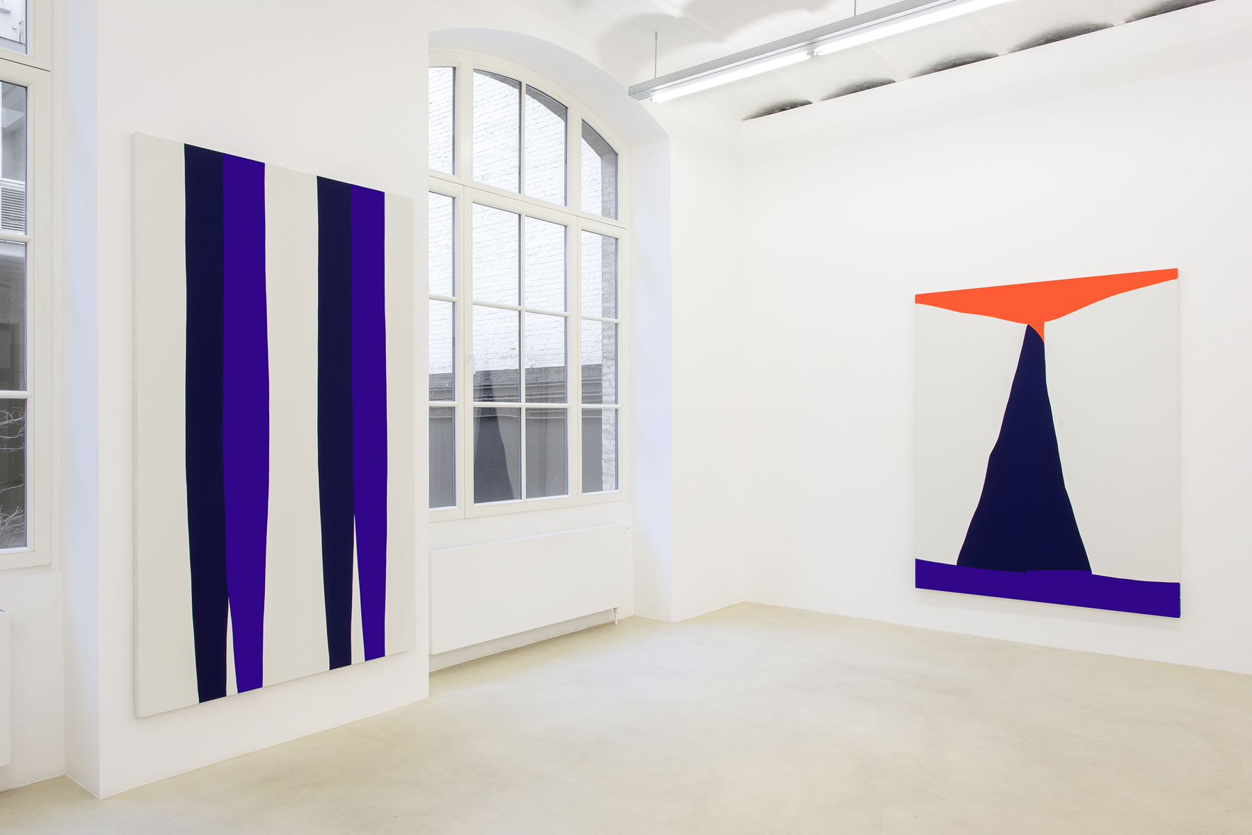
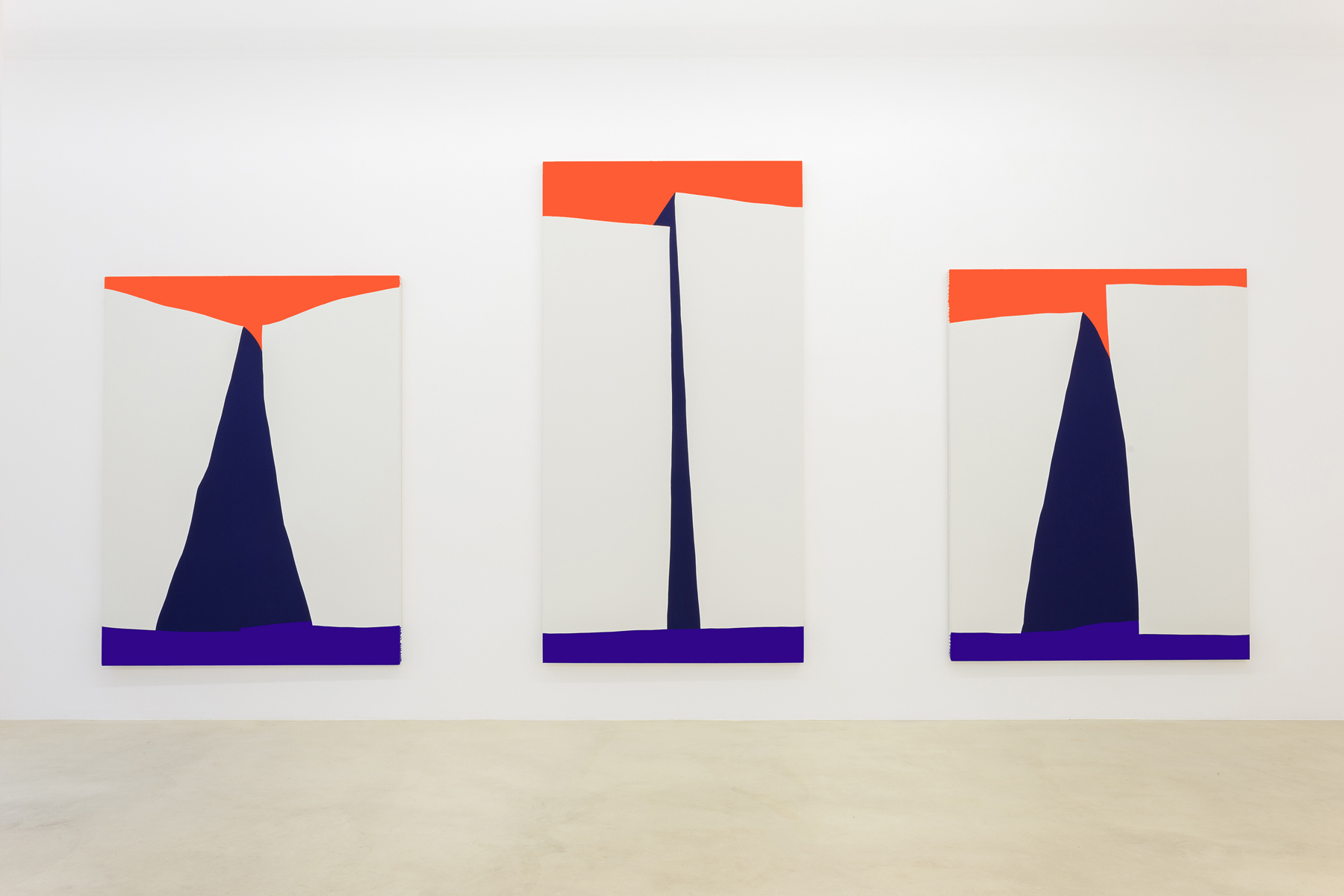
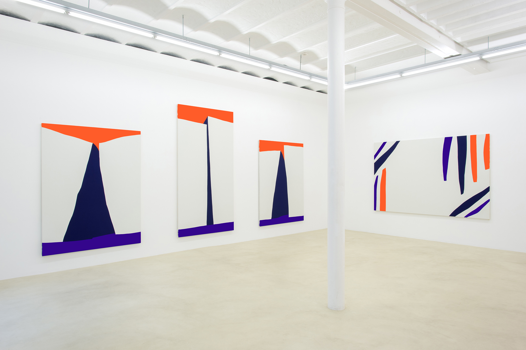
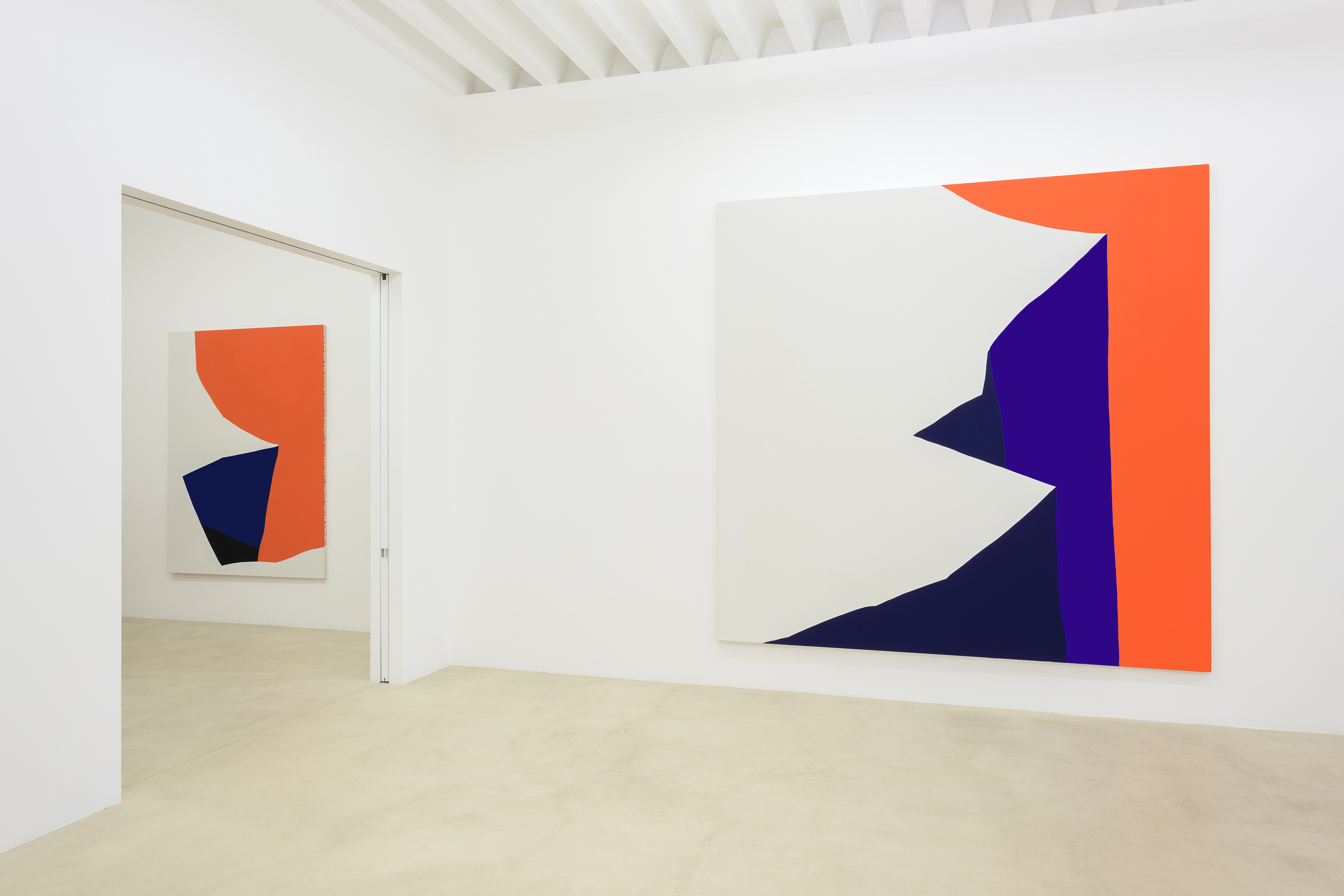
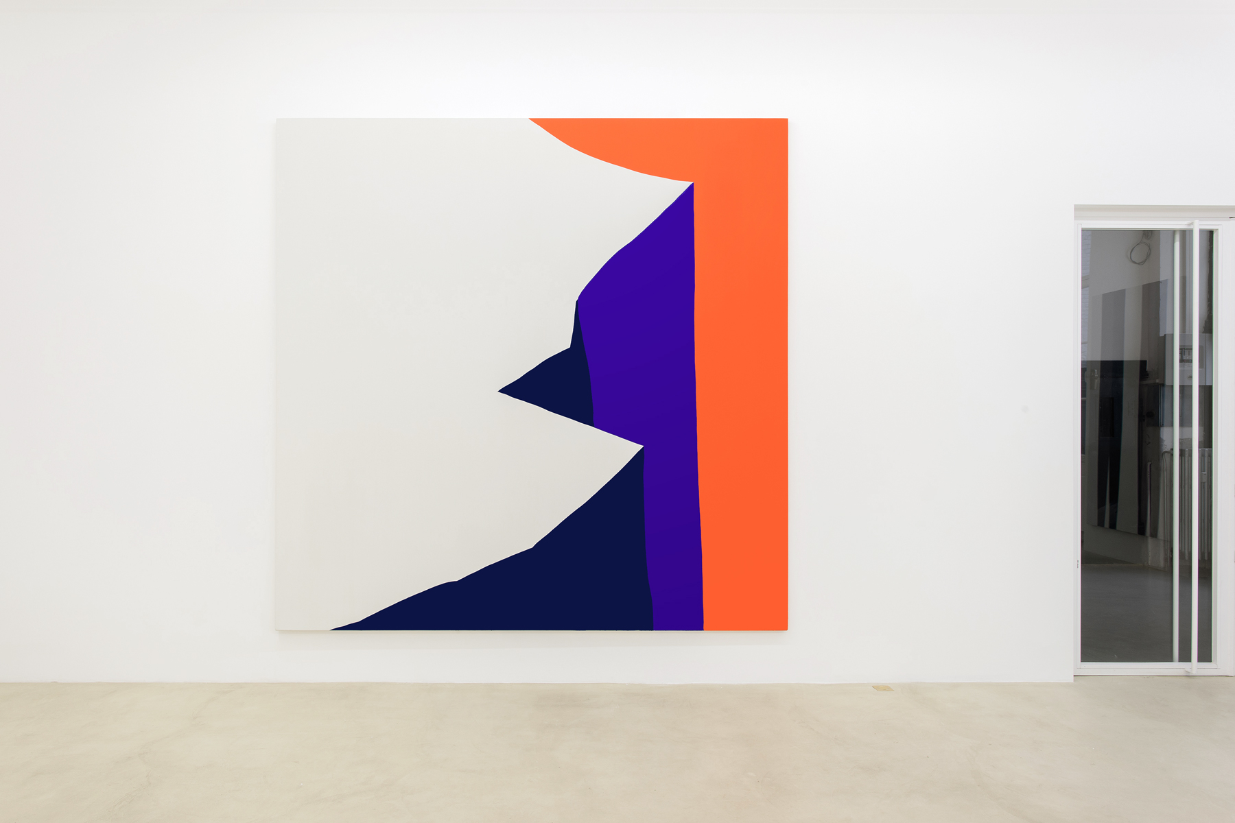
Instead, those Americans at mid-century posited a more abstract and formalistapproach, but one that was rooted in the immediacy and primacy of everyday formsof experience, and the same is true for contemporary artists like Kremer.Abstracting from familiar forms, even if taking them far beyond immediaterecognizability, enables Kremer, as it did those historical artists, to harness thesensations that arise from our day-to- day encounters —whether the impressiveprofile of a boulder or the sensual curve of a hip—so as to imbue the heraldic formsthat appear in their paintings with immediacy and an affective impact.Consider Ellsworth Kelly’s White Plaque: Bridge Arch and Reflection, 1951-55, whichtransforms the reflected light of a bridge over the Seine River into an abstract playof twinned forms and positive and negative space that can only be reduced to theoriginal source material once it is explained. Now think about Paul Kremer’sCrawler, in which a large creamsicle form lodged in the upper section of the canvasspills down the middle and either side, suggesting both the body and legs of acreature, as well as the simple impact of gravity on a liquid. The title is deliberateallowing the work to not represent any particular animal, but rather summoningthat inevitable allusion to a four-legged creature, so as to yoke it to an abstract form.There is a playfulness and humor in this image and its title; one that is even clearerin a work like Chomper, the title of which implies a set of teeth and jawbones andlends the work’s arching forms a comic angle.
Many of Kremer’s titles suggest the names that children give to things based on theiractions, uses, or physical attributes more so than their technical or scientificclassifications. As such, Kremer’s abstract forms suggest a range of things: fromsounds (Chime/Ringer), to times of day (Day/Night), to physical actions (Dive, Float,Pinch), to the activities of materials (Flow), and of animals (Crawler, Chomper,Hopper). Yet it is important to recognize that these works are not reducible to theirtitles, which are left open-ended for a reason as is the content. As much as the titlesinvite us to indulge in associative ways of thinking and render meaning out ofabstract form, so the liminal legibility of Kremer’s images challenges that impulse.Think again of Crawler; careful examination of the image shows exactly how thatconnection comes about, and all the imaginative additions needed, on the part of theviewer, to read it as an animal of sorts.
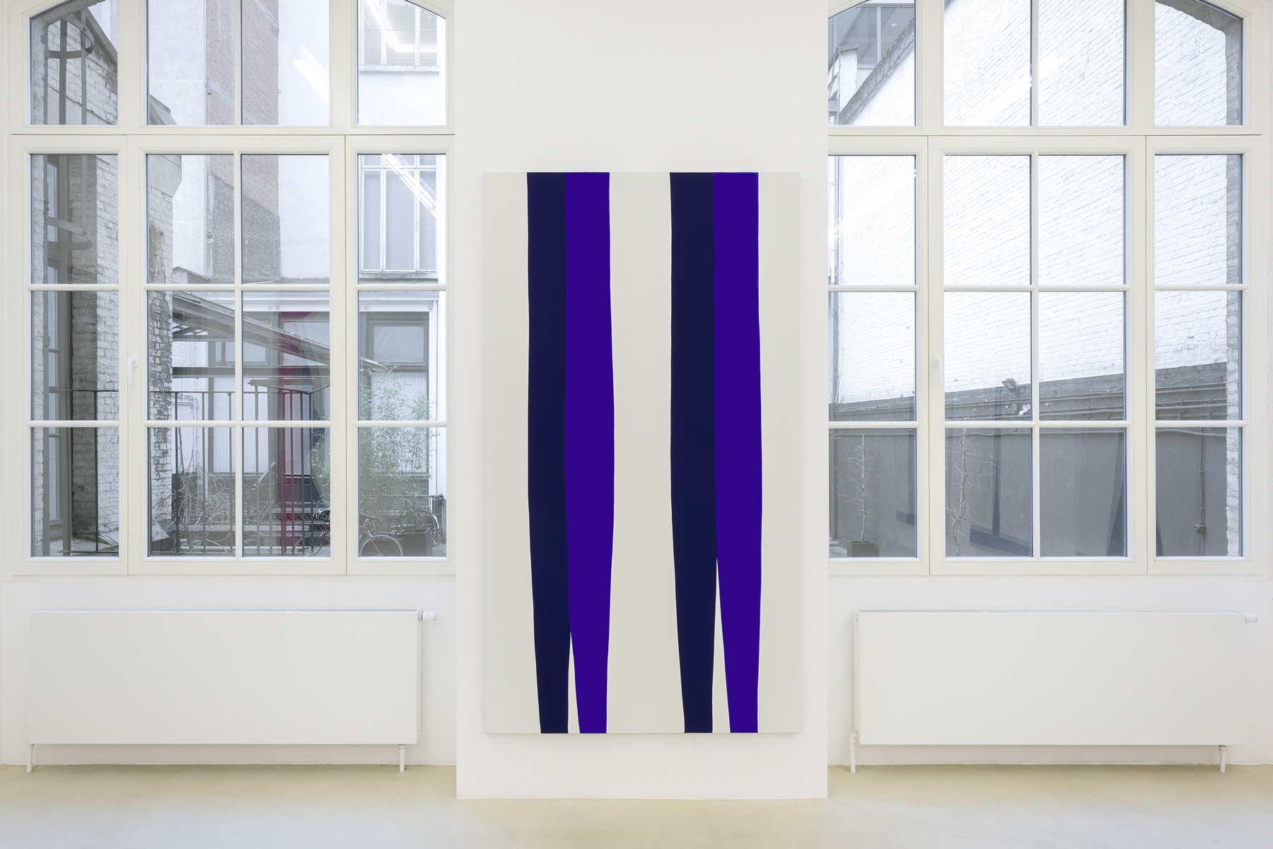
Ultimately, Kremer wants to play with his audience’s associations so as not to toosimply and easily provide keys to the work’s meaning. His ultimate goal appears tobe, as it was with earlier generations of artists, to find forms that can be imbuedwith definitive, yet non-allusive meaning. In Kremer’s works, this is clearest in hispaintings that are based less on worldly entities and more on abstract feelings suchas Hover, Hopper, Dive, etc. The role of color in his works, and his favored limited,but bright palette consisting primarily of green, orange, and blue, paired with moreneutral black, white, and grey tones is significant. Some are evocative of JulesOlitski’s biomorphic stain paintings from the early 1960s, while others take on thebuoyant organic geometry of Ellsworth Kelly’s shapes but almost as if seen throughthe lens of a children’s coloring book. Kremer’s lines are sharp but not hard-edged.In this way, they resemble collage and perhaps most closely, Matisse’s use of theform in the more abstract parts of Jazz, which achieve a graphic clarity.
In terms of structure, Kremer’s paintings are perhaps closest to Kelly’s in the waythat they find a stable architecture in their resolute two-dimensionality. For Kelly,this emerges from his references to the built environment, from which he deriveshis forms: in the arcs of bridges, the lines of handrails, and the grids of windows, forexample. Kremer’s colors are often arranged in bold contrasts, such as in Float 4where the base of a dome-like orange shape is submerged in a teal rectangle. Theparts that overlap approach black, creating a strong sense of both downwardmovement and overall balance that suggest the floating sensation of the title. This istrue also of Hopper 3 where a navy plane is sandwiched between two passages ofwhite, and bordered on the left by a column of strident orange, giving us the feelingof a curving movement analogous to the quick, fervent motion of hopping. It alsocannot be ignored that, as much as the title evokes an action, so too does it suggestthe compositions of the American artist Edward Hopper, such as the freightedjuxtaposition of sky and architecture in paintings like Early Sunday Morning orRooms by the Sea. Another example of the plurality of references Kremer’s worksconjure up.
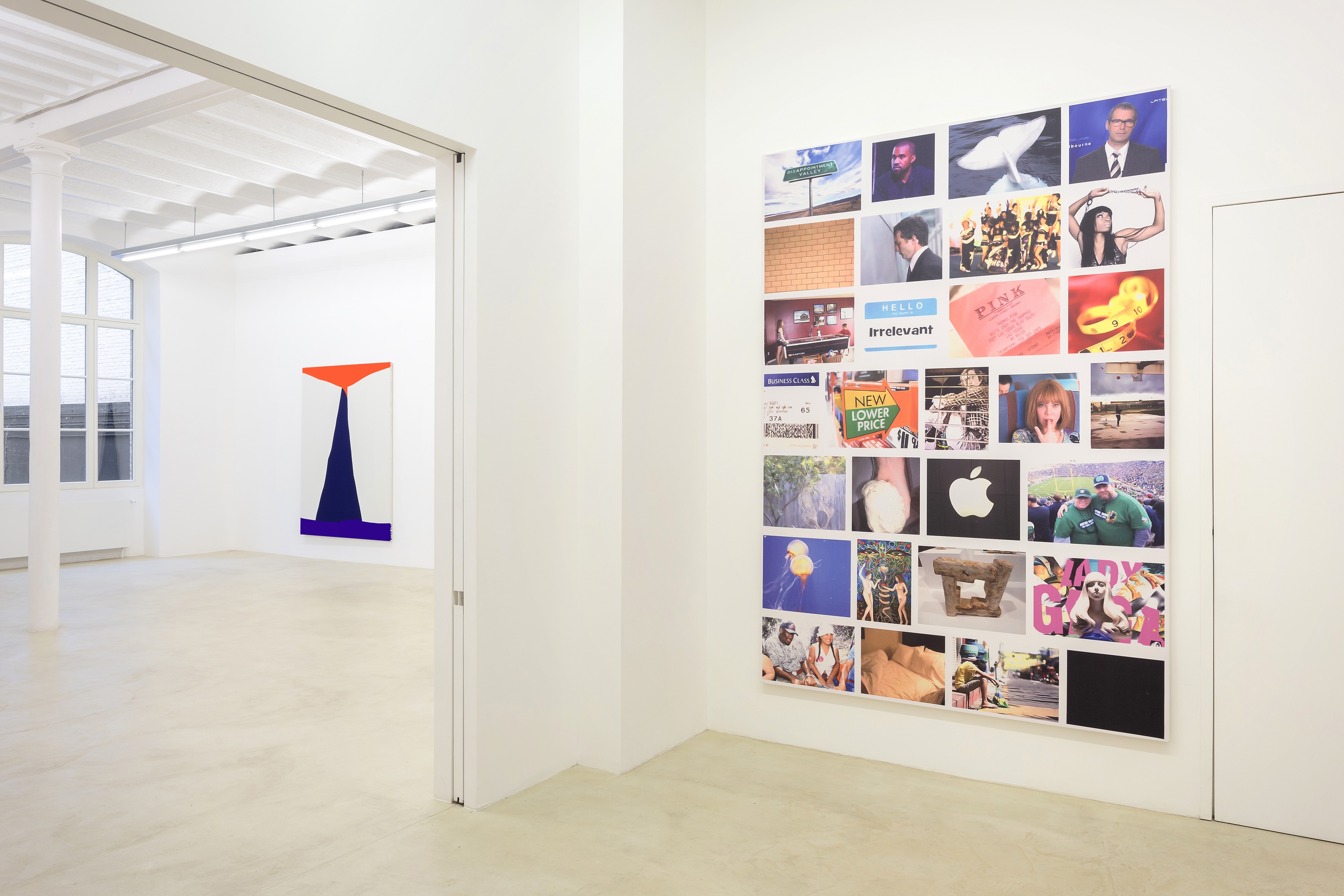
All of this may seem highly formalist in orientation. However if we consider thecontext provided by the system of semantic possibilities for the image in which thepainting operates, a political valence for its approach becomes evident. Kremer’sresistance to any definitive meaning must be understood in relation to theproblematics surrounding the efficacy of images to stand for anything today. AsDavid Joselit has recently argued (“Material Witness,” Artforum [February 2015]),we can no longer (if we ever could) suppose that images stand for themselves, theindexical nature of the photograph ensuring that it testifies to something concrete.Real world events such as the inability for a grand jury to indict the police officerwho choked Eric Garner to death on Staten Island, despite the existence andcirculation of an explicit video recording documenting the event, demonstrates this.In the face of such a seeming impossibility of meaning inhering in things in adefinitive way, of such a deep skepticism about the putative truth-value of an image,or rather, more accurately, an apathy around it, perhaps the only response is a self-consciously unresolved image. Or perhaps more accurately, one that, in seeming tobe so, can sneak through what turns out to be an overloaded plethora of meanings,responsive as it is to the injunctions of both viewers and the various sites in whichboth the painting and images of it circulate.
That Kremer is interested in this aspect of the work’s many lives is evident whenwe consider the many online spaces he is involved in—from Great Art in UglyRooms to Art Scrub—which explore the ways in which images of artworks functionboth virtually and in the world. It must be said, as a way of concluding, that Kremeralways injects humor into his compositions. This allows his particular take on thepoverty of images to have a playful, even hopeful quality. Suggesting that ourconfrontation with this situation might eventually lead to its improvement.